Making candidate assessment technology feel human.
Selection Lab builds assessment technology that helps companies hire better, from personality and cognitive testing to fully gamified, role-specific assessments. It's a genuinely technical product, built to handle complex decisions at scale. The challenge was that in a landscape full of technology products, Selection Lab wanted to keep that true human connection that HR managers really crave. It’s about technology helping them make better decisions with the best candidates, not removing human interaction from the recruitment process.
Selection Lab needed a brand that could balance the approachability and human sided HR teams, with the slick, high-end technology product it really is.
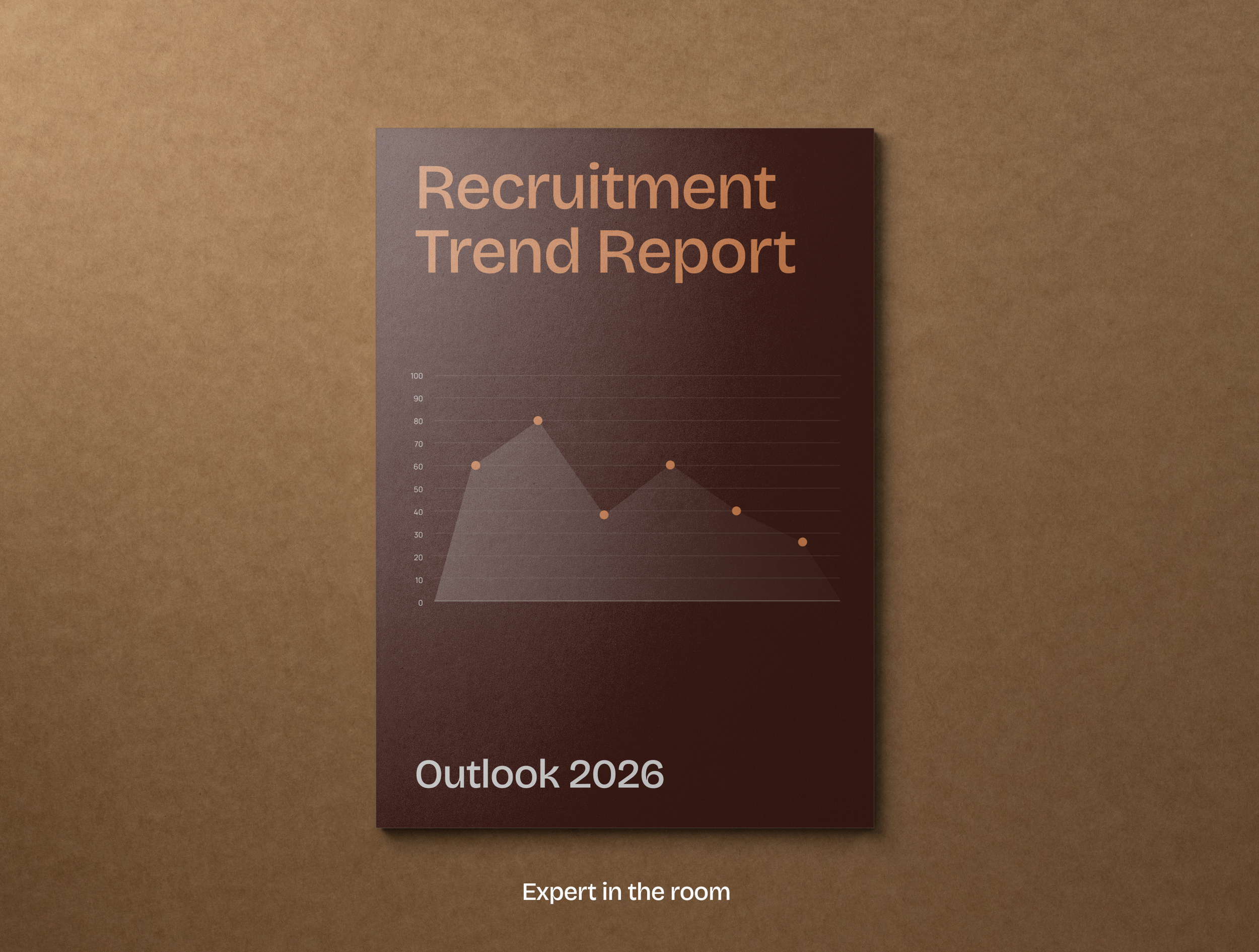
Assessment tools live in a strange spot. They're built entirely on data, logic, and technology — but the moment they feel like that to a candidate or a hiring manager, they stop working. Trust drops. The experience feels transactional rather than considered.
Selection Lab needed a brand that could hold both truths at once: rigorous enough to be credible as a serious piece of technology, warm enough that nobody using it felt like a data point.
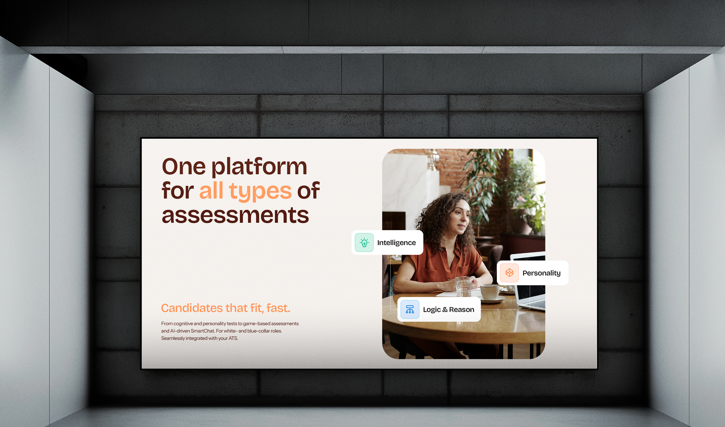
Colour
The palette starts from parchment — a warm, considered base that sets the tone for everything built on top of it. Orange sits as the primary accent, a genuine pop of warmth running through every application. Alongside it, a secondary palette of greens and blues was built specifically to differentiate between assessment types, so the system carries meaning as well as mood.
Shape
Rounded tiles and cards run through every application — decks, web, product screens — giving the brand structure without hard edges. It's a small decision that does a lot of quiet work: everything feels approachable, even when the content behind it is dense.
Iconography
A custom icon set was built for each assessment type, adding a playful, human touch to what is, underneath, a serious decision-making tool for both employers and candidates.
Data, told simply
Impact and results needed to feel tangible, not buried in a table. Large-number tiles — "15 minutes saved," "27% fewer drop-offs" — turn statistics into something scannable and confident. Where the story is about complexity — multiple systems, integrations, assessment types working together — simple line-work diagrams show the connections at a glance.
What Selection Lab now has is a brand that can sit next to their own technology and never fight it — a system warm enough to build trust with candidates, and sharp enough to hold up in front of enterprise clients like KPN. It shows up the same way whether it's on a homepage, a pitch deck, or a phone screen.
www.selectionlab.com

“Reulo really took on board that we needed the branding to reflect the feedback we'd gathered from the community, striking a balance between being warm and homely, whilst being modern and clean. They thought carefully about our story, and our target audiences, and created a brand that the community love and that has quickly become a recognisable part of the local landscape.”
— Laura Mai-Harte